Zain-Basics' packaging redesign aims to reflect Zain identity
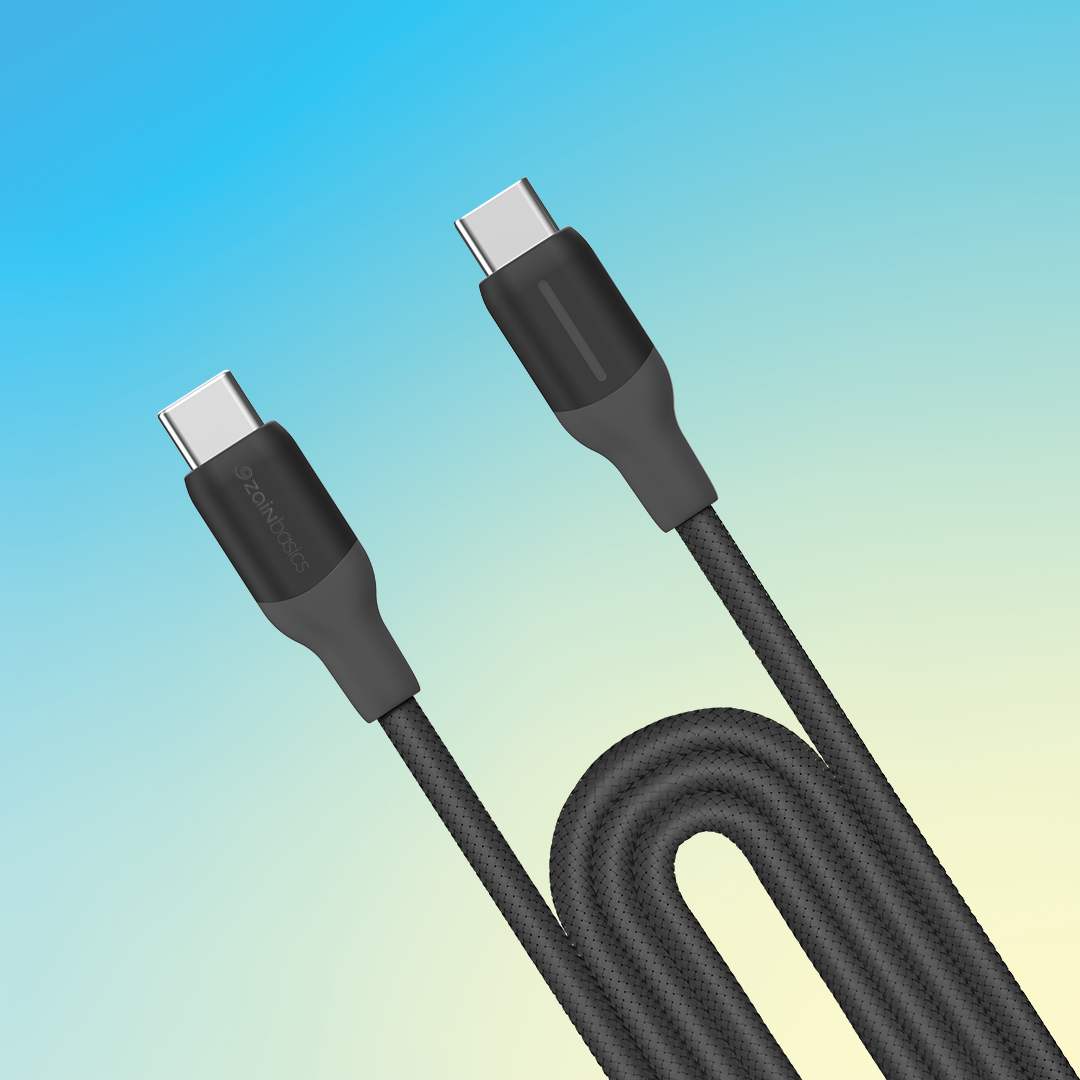

Make Zain-Basics instantly recognizable as part of Zain
while standing out with a sleek, modern aesthetic design
while standing out with a sleek, modern aesthetic design
With this vision in mind, we embarked on a journey to transform Zain-Basics' packaging,
focusing on two of the brand’s most iconic elements:
Zain’s Patterns & Gradient
focusing on two of the brand’s most iconic elements:
Zain’s Patterns & Gradient
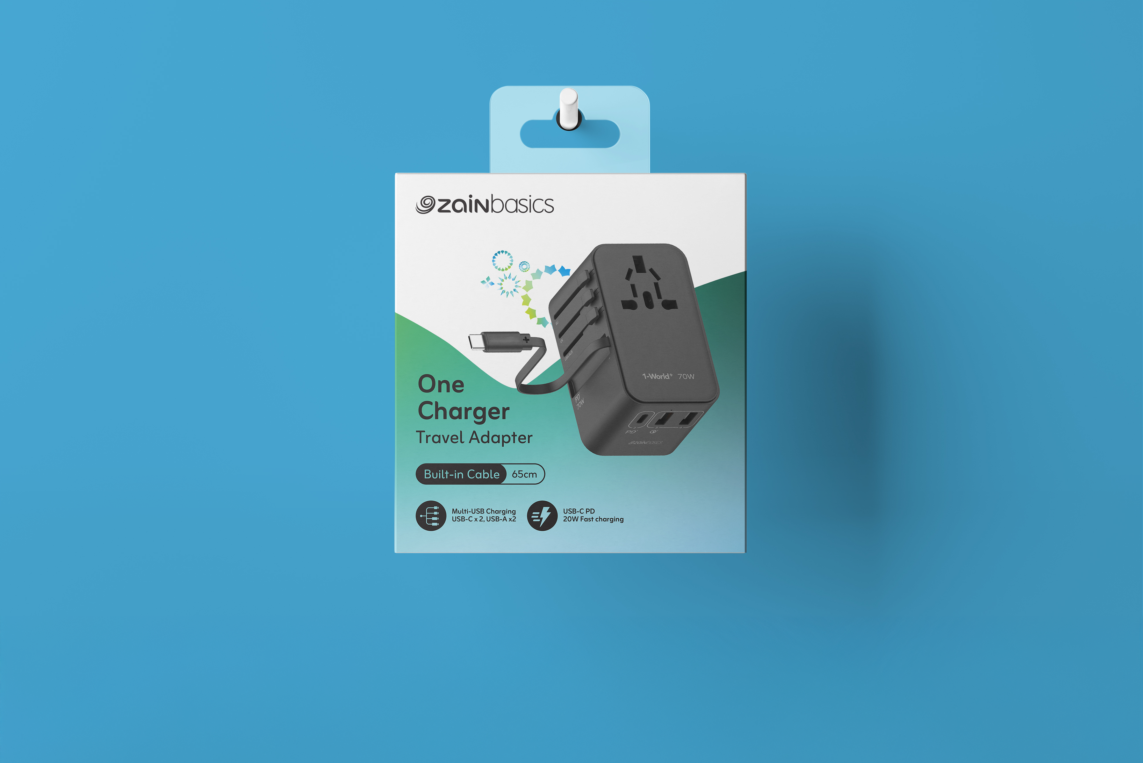
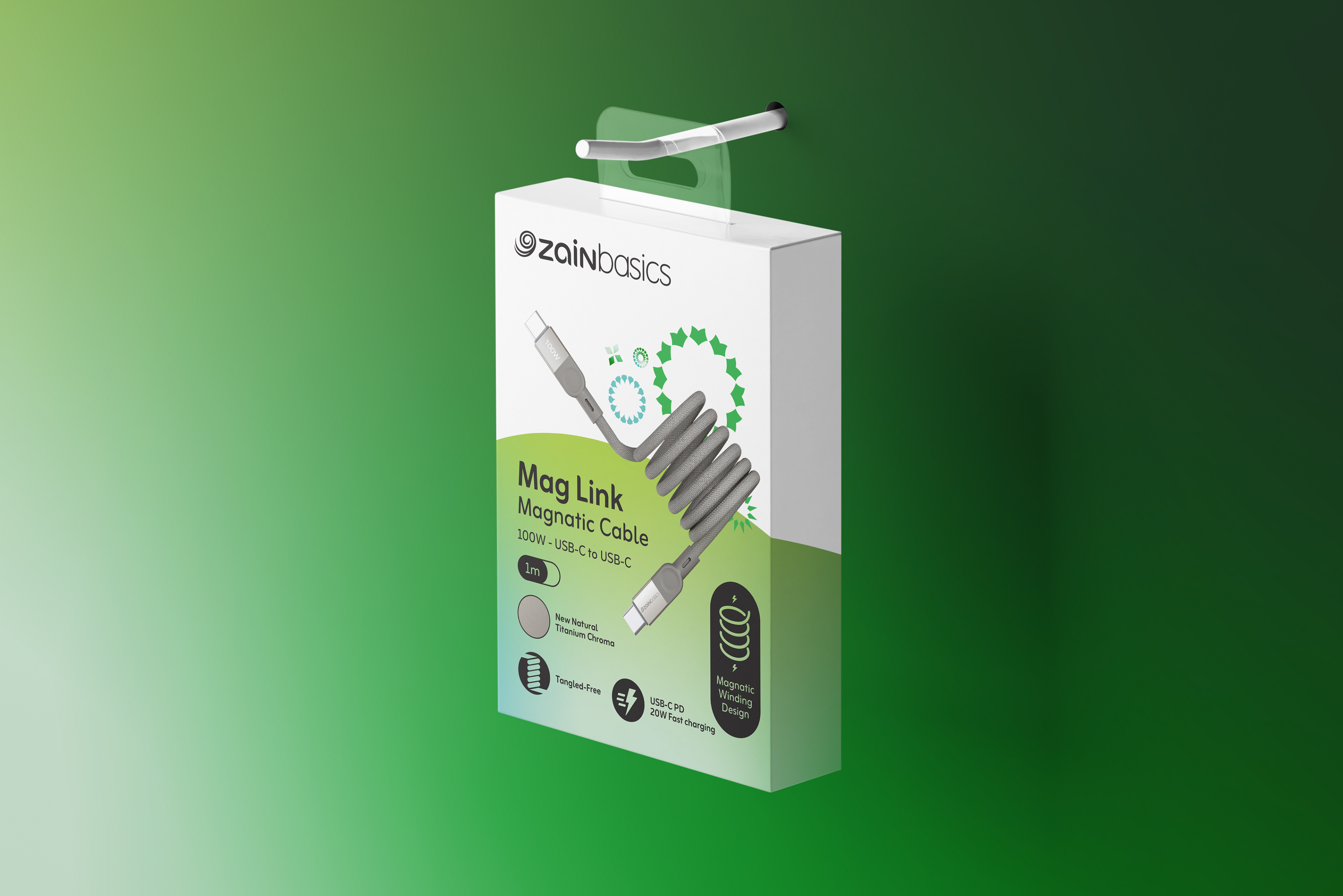
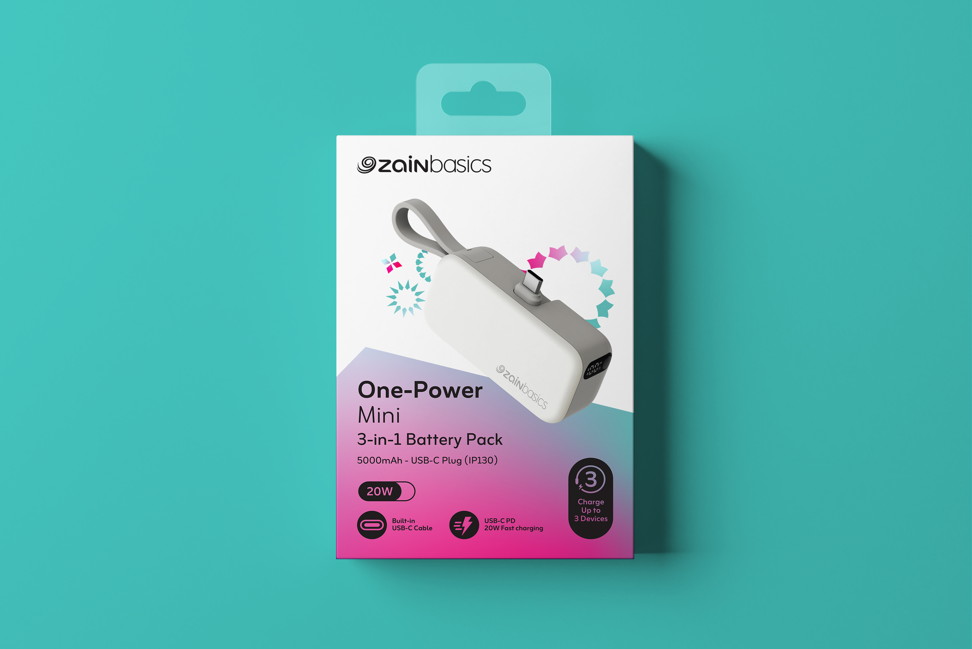
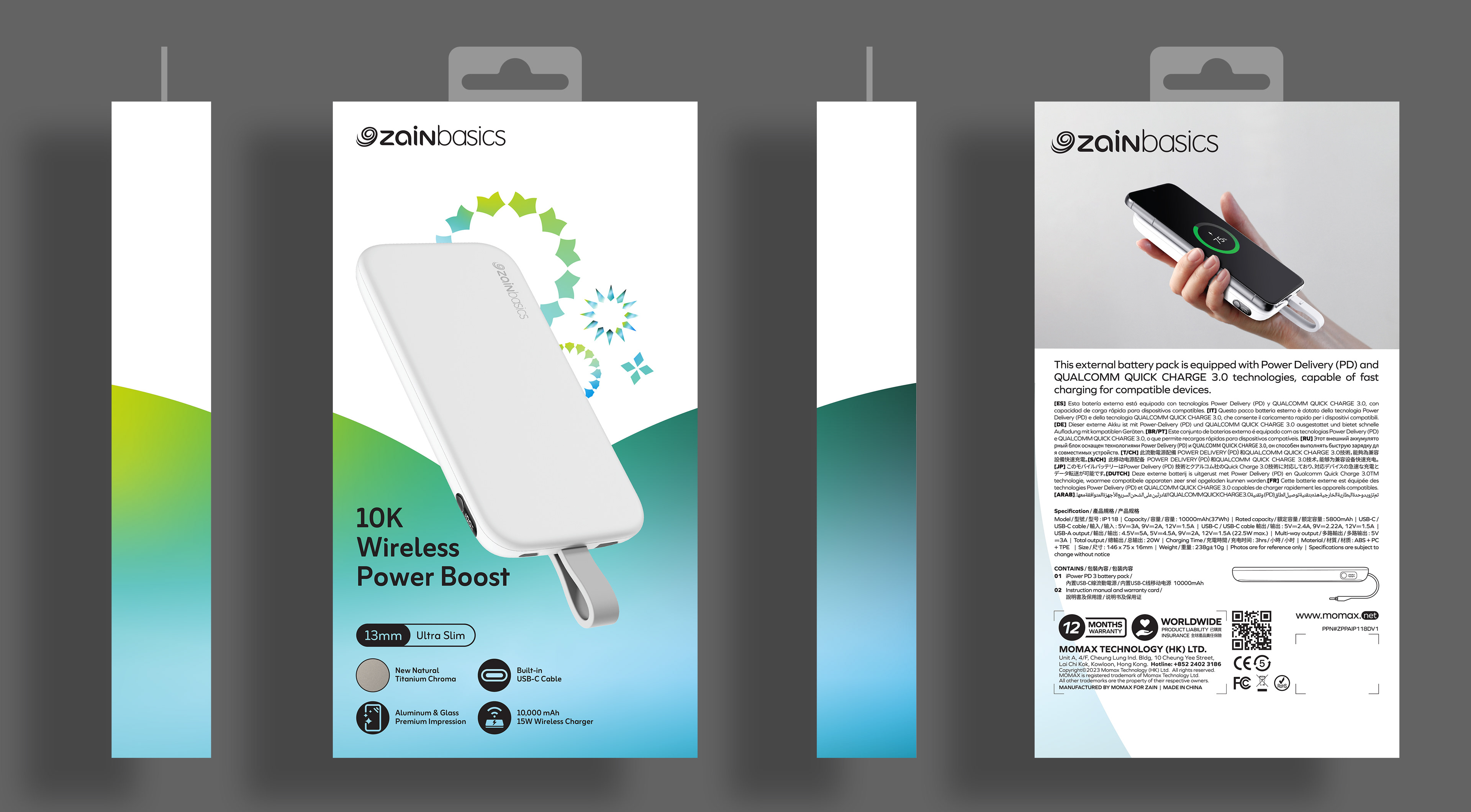
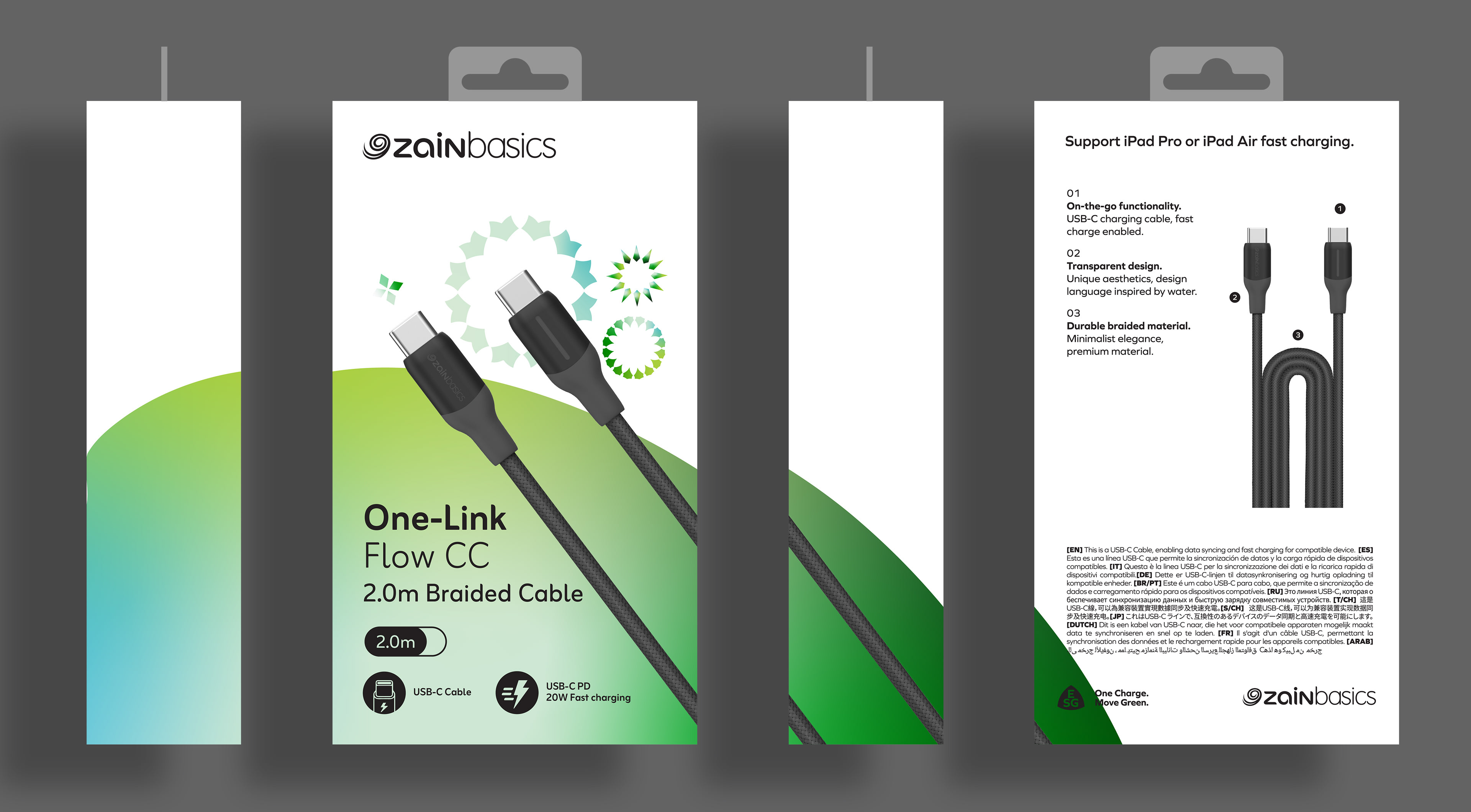
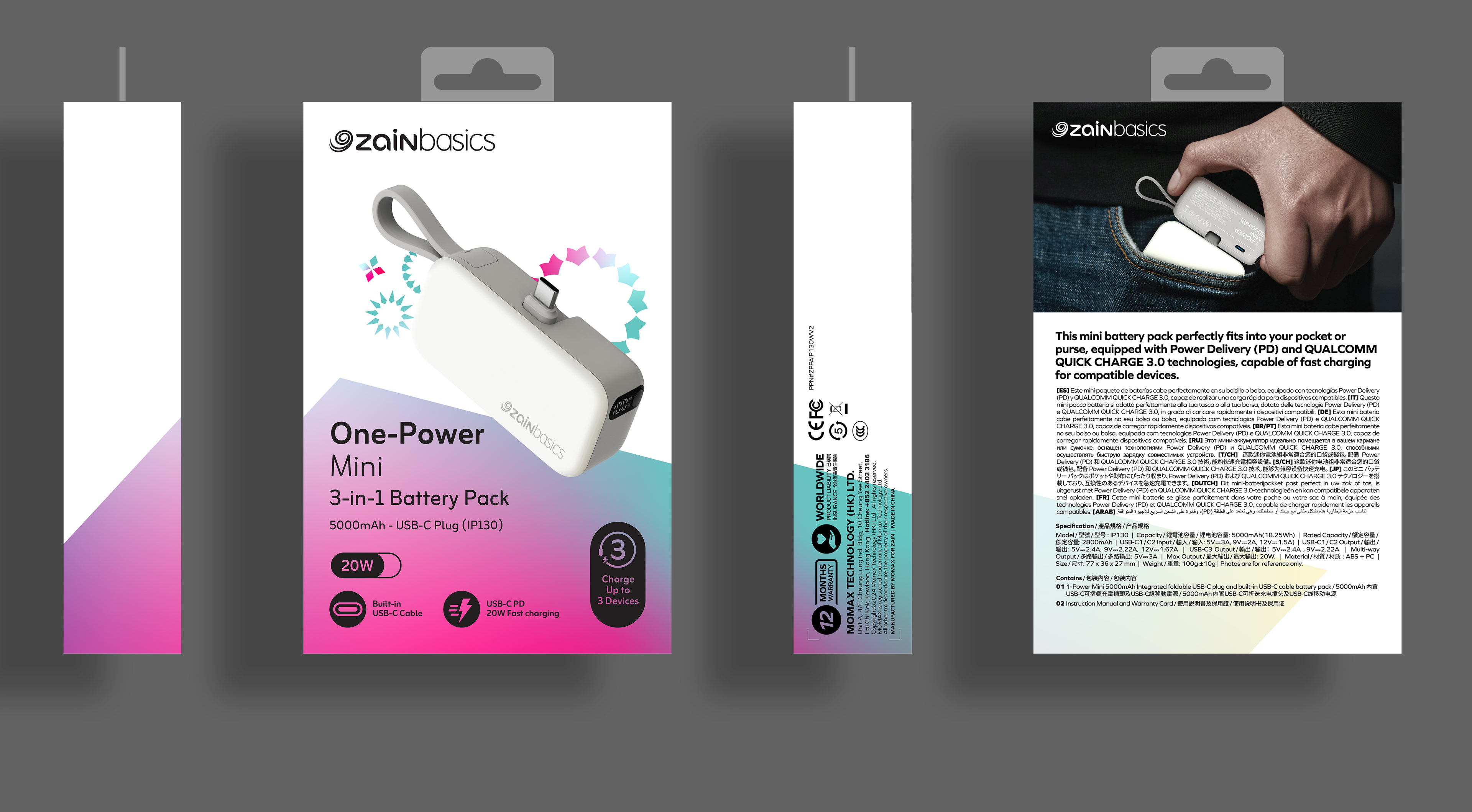
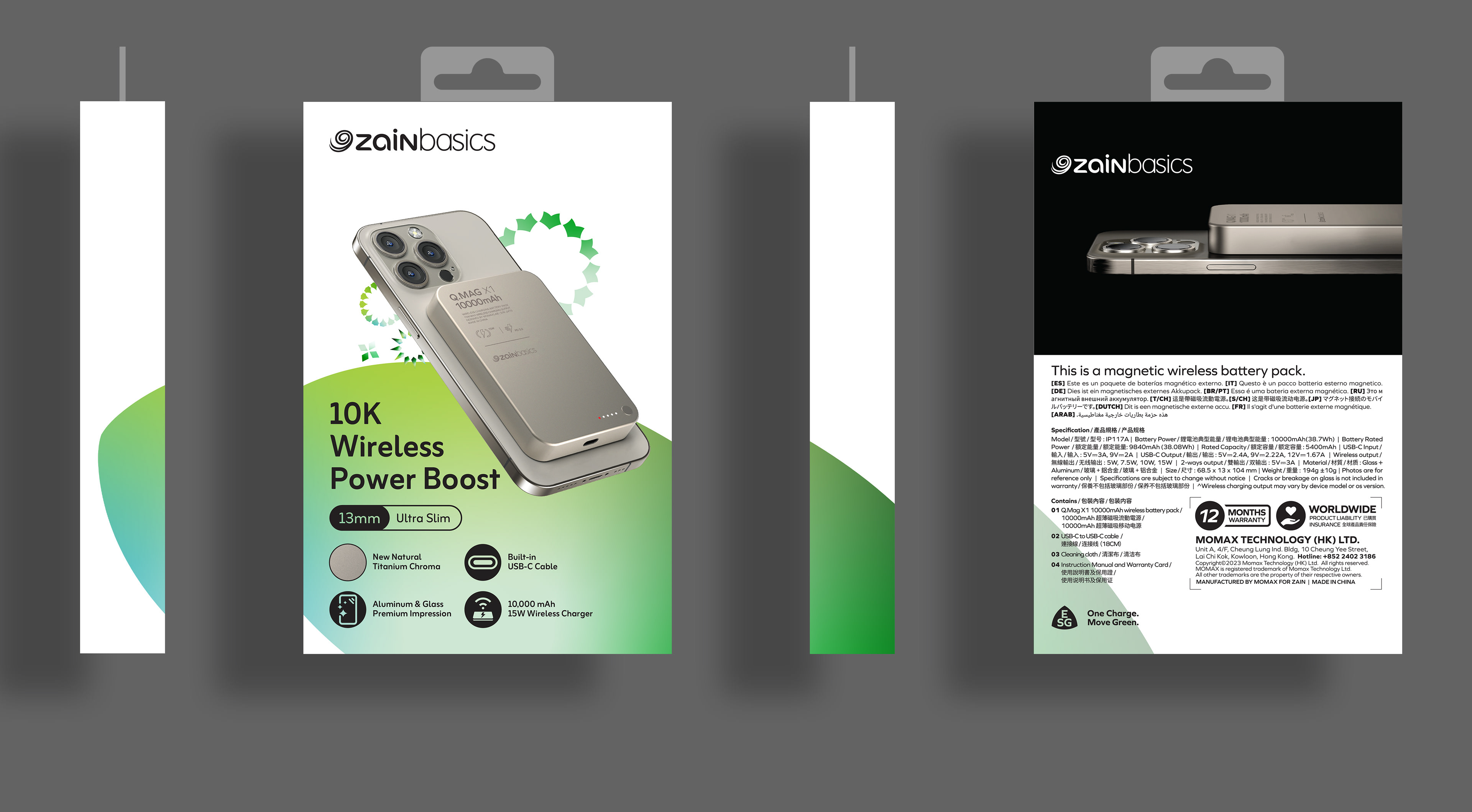
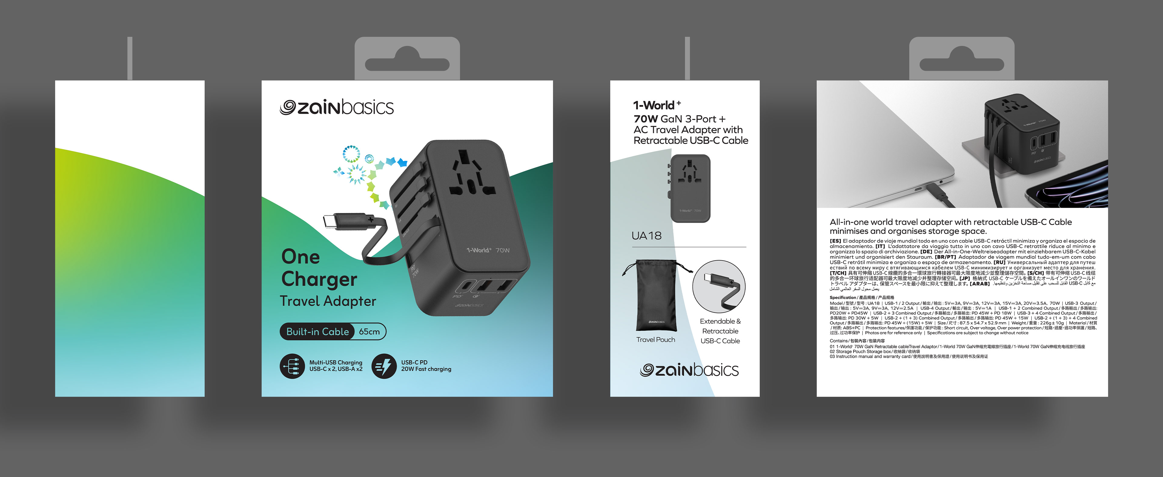
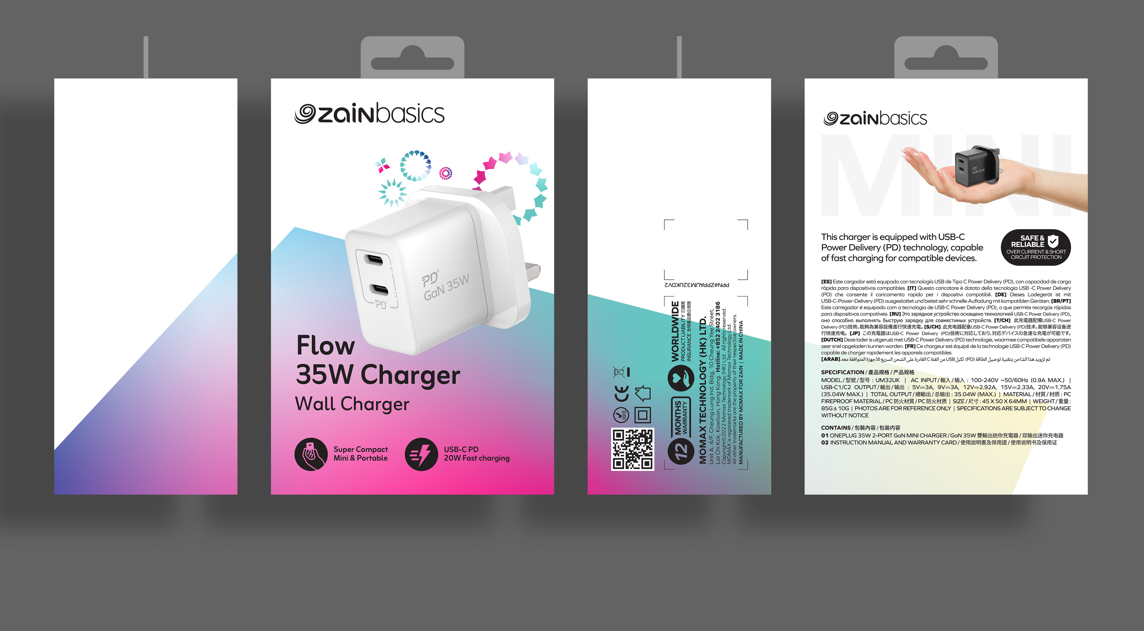
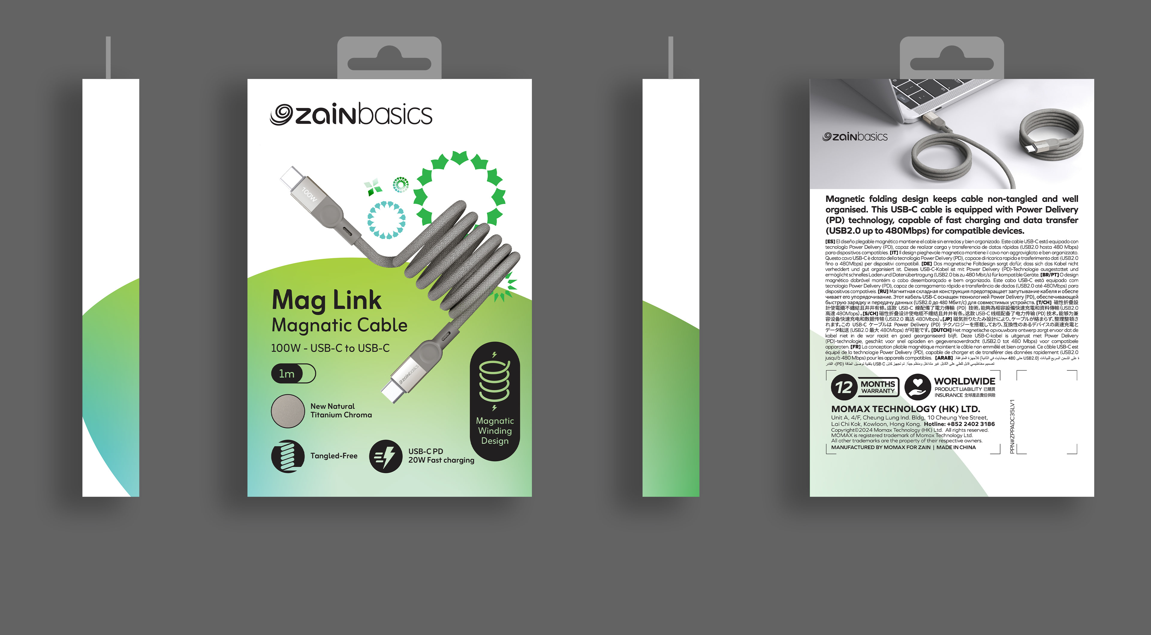
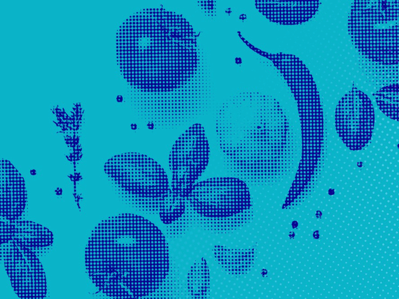
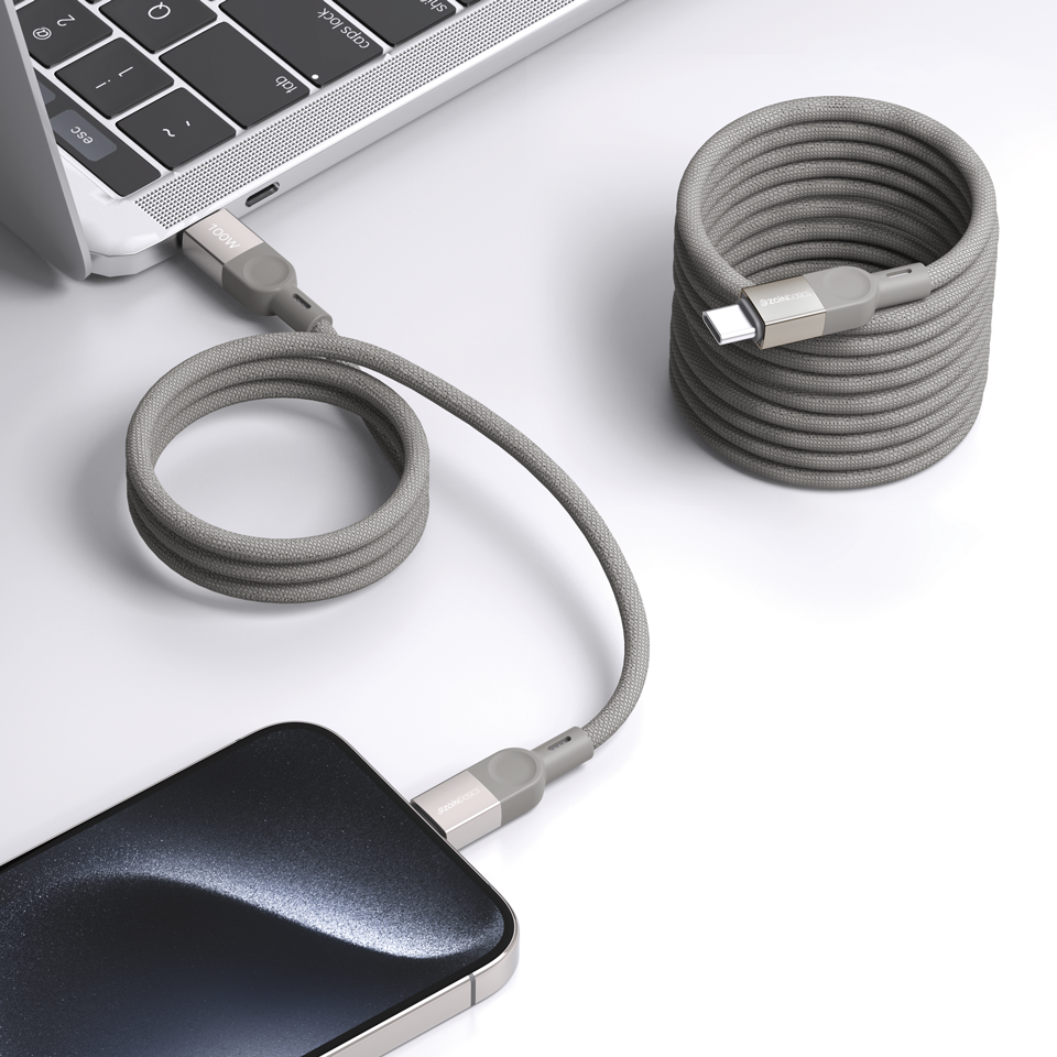
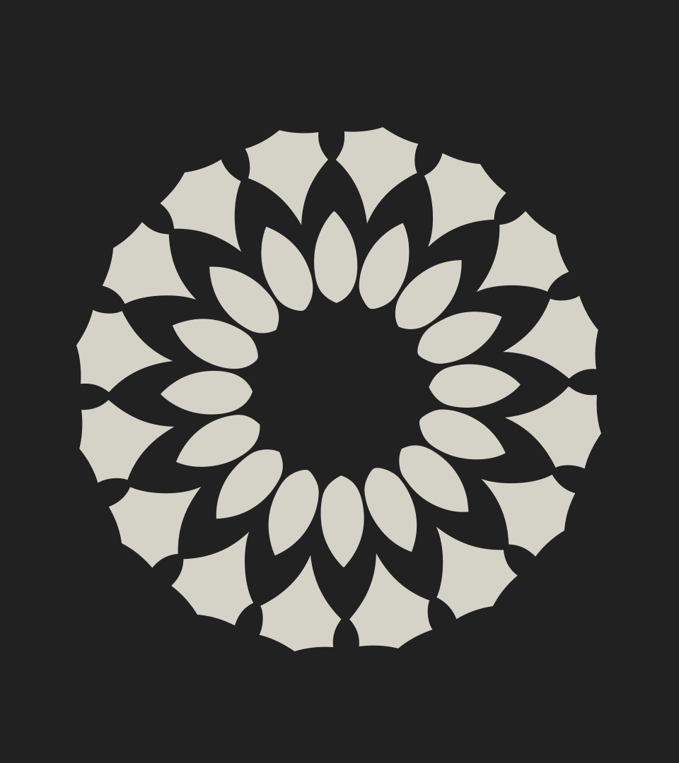
Zain Patterns
Iconic Recognition at a Glance
The Zain Patterns—abstract, organic, and visually engaging—are more than just a design feature. They represent the heart of Zain's identity, making any product they adorn instantly recognizable.
Iconic Recognition at a Glance
The Zain Patterns—abstract, organic, and visually engaging—are more than just a design feature. They represent the heart of Zain's identity, making any product they adorn instantly recognizable.
To emphasize this, the packaging incorporates core elements from these patterns, allowing them to take center stage in the design. Each packaging design was meticulously crafted to balance bold pattern usage with clean, modern layouts.


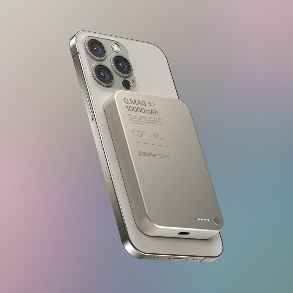
Zain Gradients
The Power of Harmony
The Power of Harmony
Zain’s signature gradient—a mesmerizing blend of green, blue, and purple—serves as a visual anchor for the brand. By integrating this gradient across the product line, we ensured the packaging exuded vibrancy, innovation, and connectivity, key attributes of the Zain brand.
The gradient was used in strategic areas: as bold backgrounds, subtle accents, and even in typographic treatments, creating a cohesive yet dynamic aesthetic.